

schofield watch company - b6 watch box
brief
To design a watch box for units -£200 per unit - for Schofields next model, the B6, which will be themed around the coast of England, with a unique opening experience.
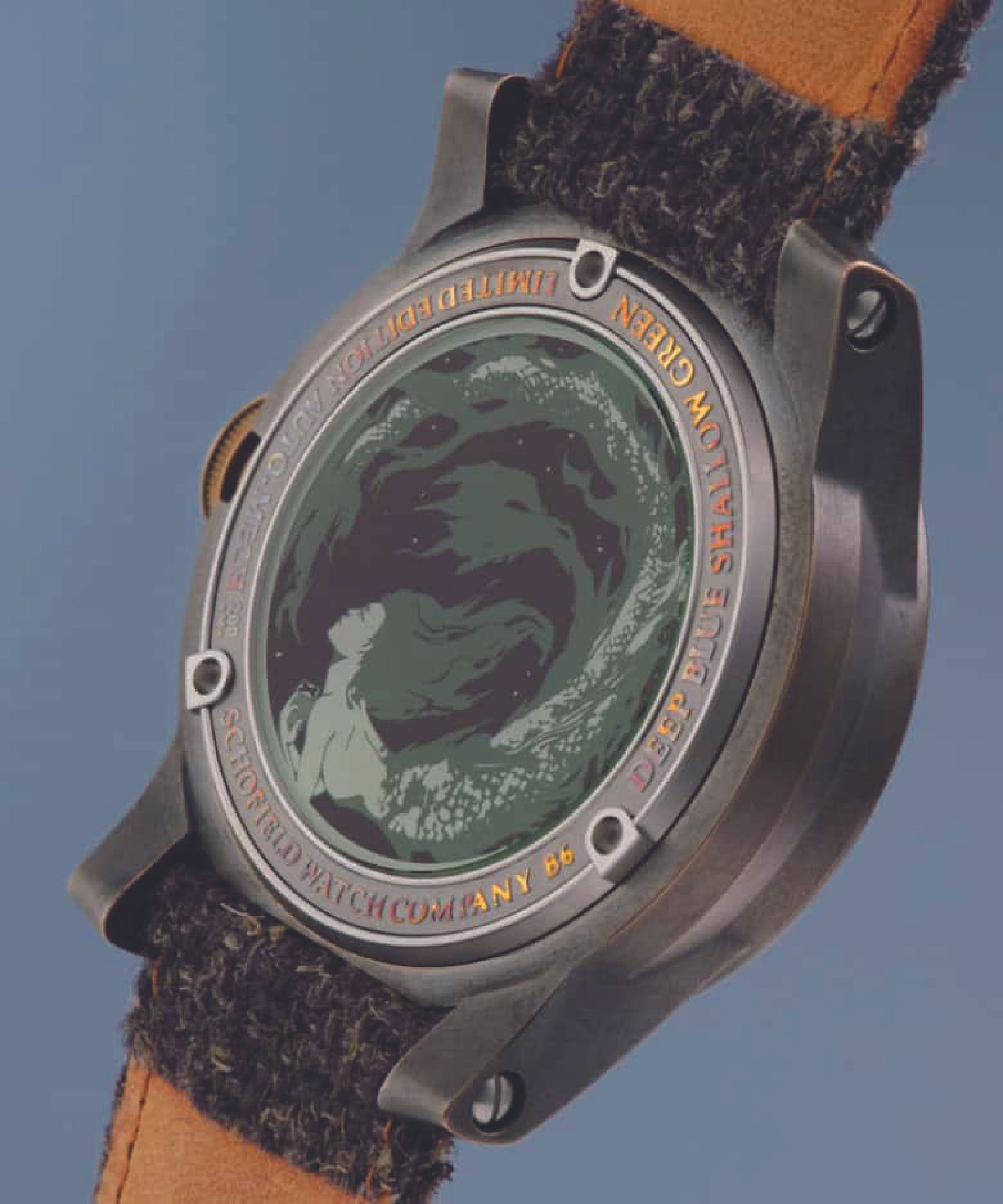
“A limited edition of 50 watches in each colour Deep Blue or Shallow Green, made to reflect the austerity and grim”
weather that is often found across the UK, made even less clement if you are on the coast. The colours are that of British seas.
about schofiled
With hyperbolic strap-lines like “Pioneering watchmakers from the new era! Watches that Weather and Made by Thinking” describe something that the youth would call extra! This is ok, it is a byproduct of Schofield’s CEO Giles Ellis enthusiasm for pretty much everything. Since 2008 Schofield has tracked its own course, unwavered by industry trends and persuasion. Making watches for those that favour depth and reason.

“A limited edition of 50 watches in each colour Deep Blue or Shallow Green, made to reflect the austerity and grim”
research

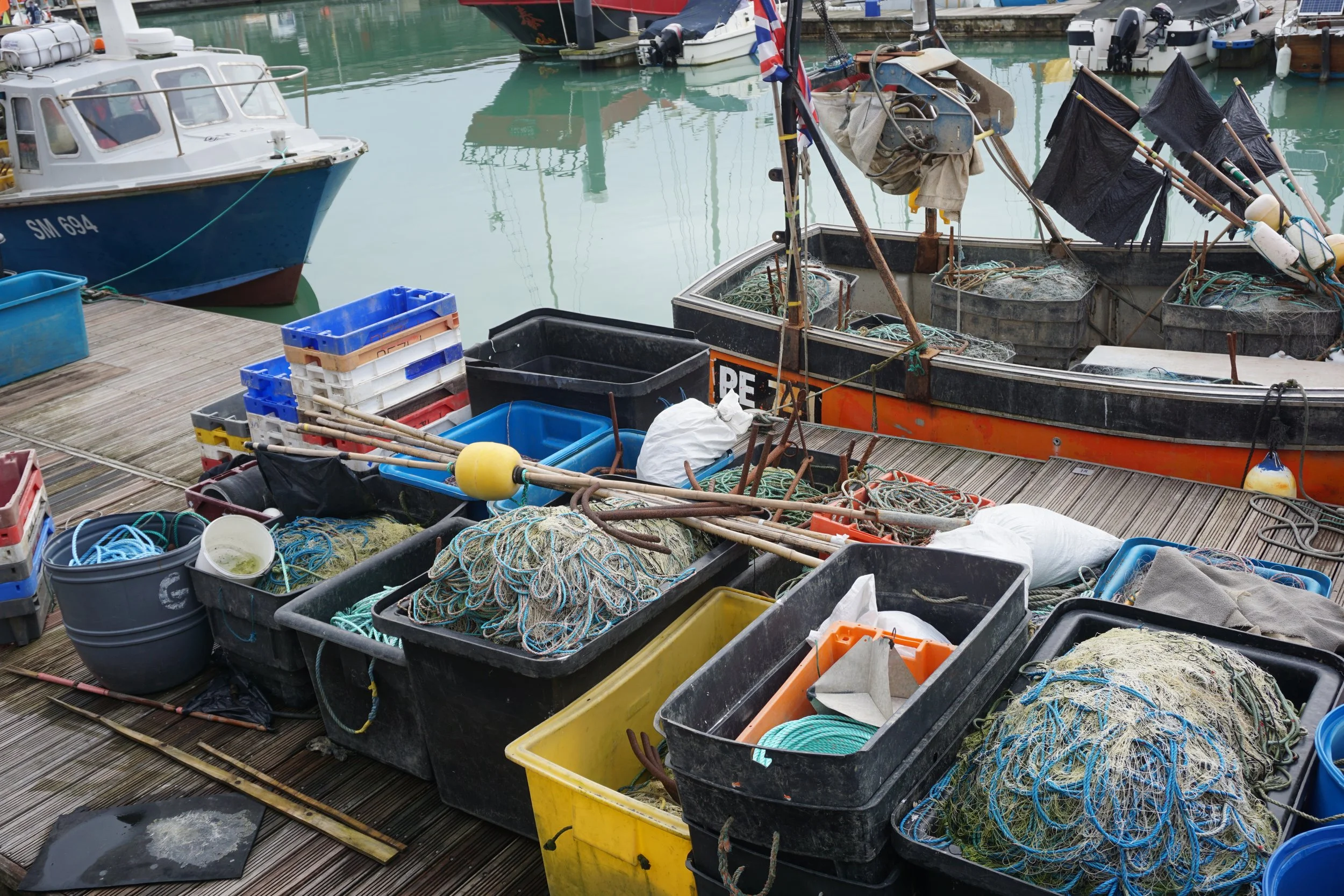
harbour culture
We gathered through interviews with the Designer of Schofield to understand his style and the requirements within the box design. From the interviews we understood that the box needs to link to the theme of the B6 Watch box, (England Harbours) through its appears; a must tell a story.
This led us to explore the culture of harbours and sailors, to give us an understanding English harbours to better tell a story through the B6 Watches’ box.
From our research, we understood that sailors are superscious in myths and legends, believing in pagans saints and omens, causing tattoos, being one of the main ways they expressed their journey across the seas and their beliefs that they believed would keep them safe.
We incorporated these beliefs within the box design development, which in turn would convey a hidden story to those who know of these symbols.
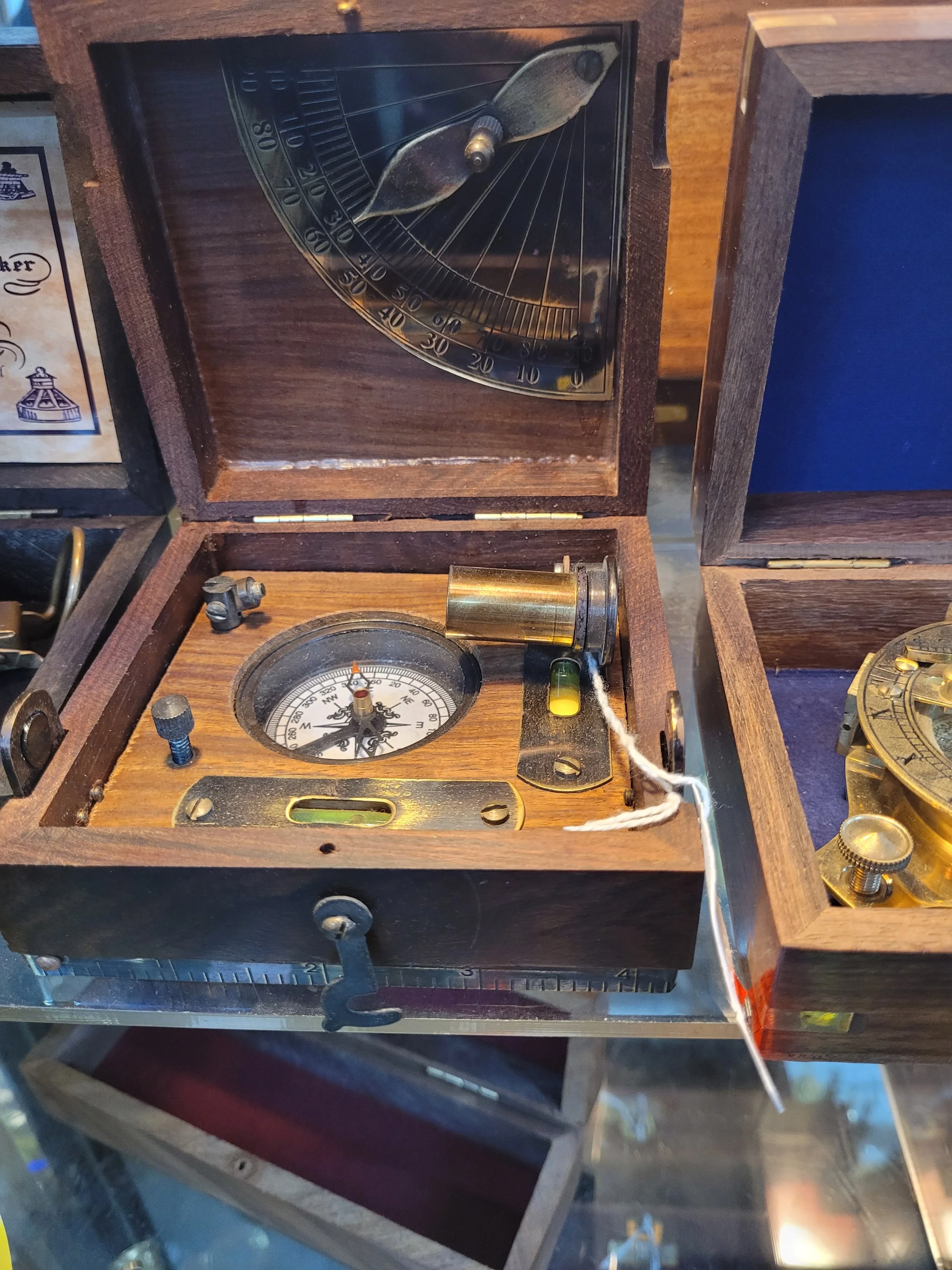

Further research into compasses and sailing equipment helped us understand the aesthetic and lifestyle of sailors. Wood and brass—commonly used in nautical gear—emerged as key materials, and will form the foundation of our product's design.
prototyping
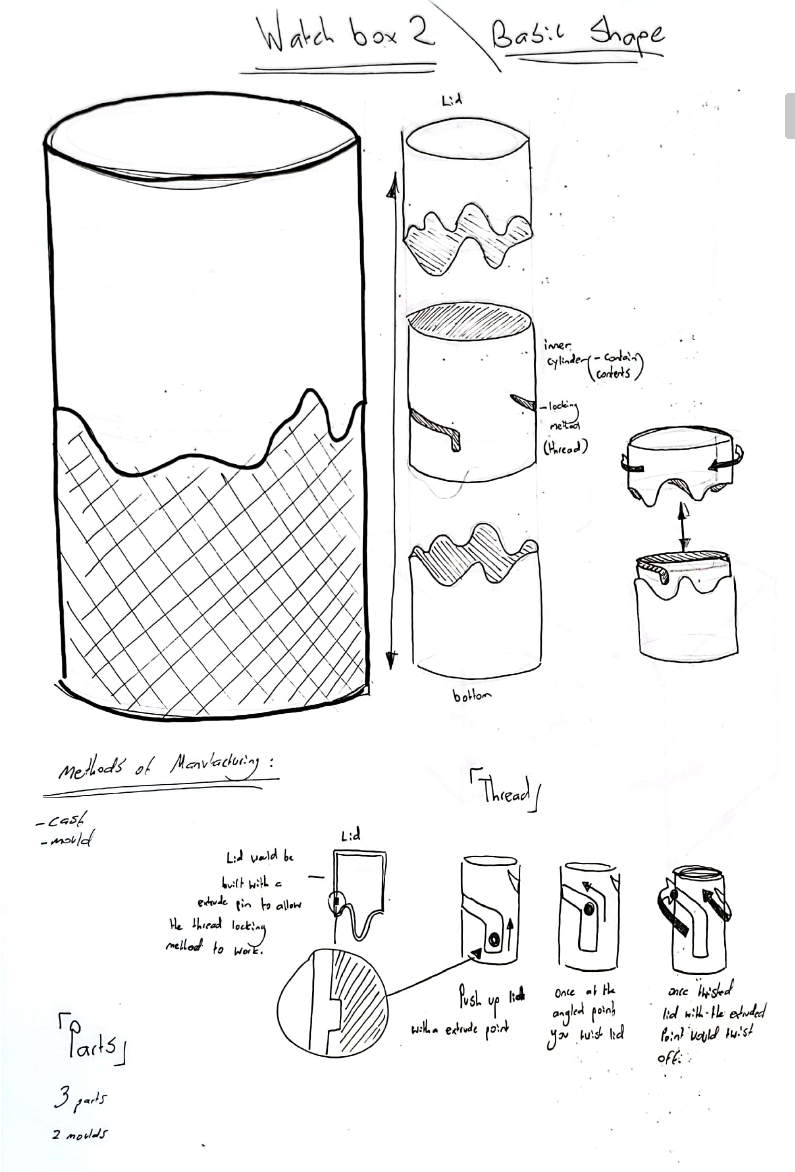
From out interview with the client, Giles Ellis found that the watch box concept No.2 was the most intriguing and the best suited for customers to interact with, and gave important insight in possible story elements and manufacturing.
We explored various textures and materials to enhance the narrative and appearance of the watch box, aligning with the project brief. This concept was pitched to the client, who responded positively to the story, the unique pull-and-twist opening mechanism, and the choice of cedar and brass—materials rich in maritime heritage.

1st prototype
However, client feedback from Giles Ellis emphasised that refining the manufacturing methods and detailing should be the next priority to meet his specifications and bring the project to completion. Lastly, Client recommended to aim for the box to be made from one material, challenging us to solve a manufacturing problem.
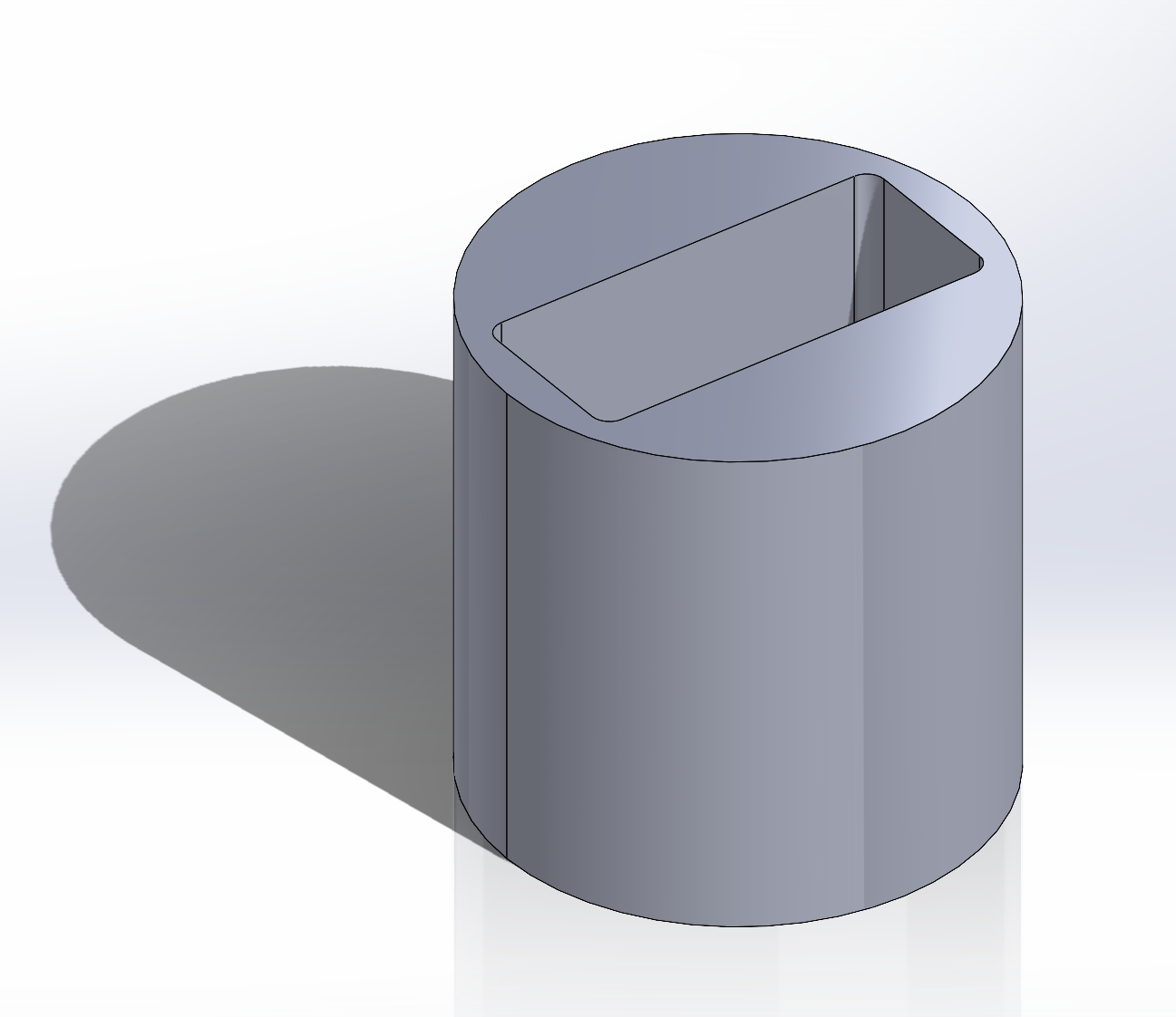
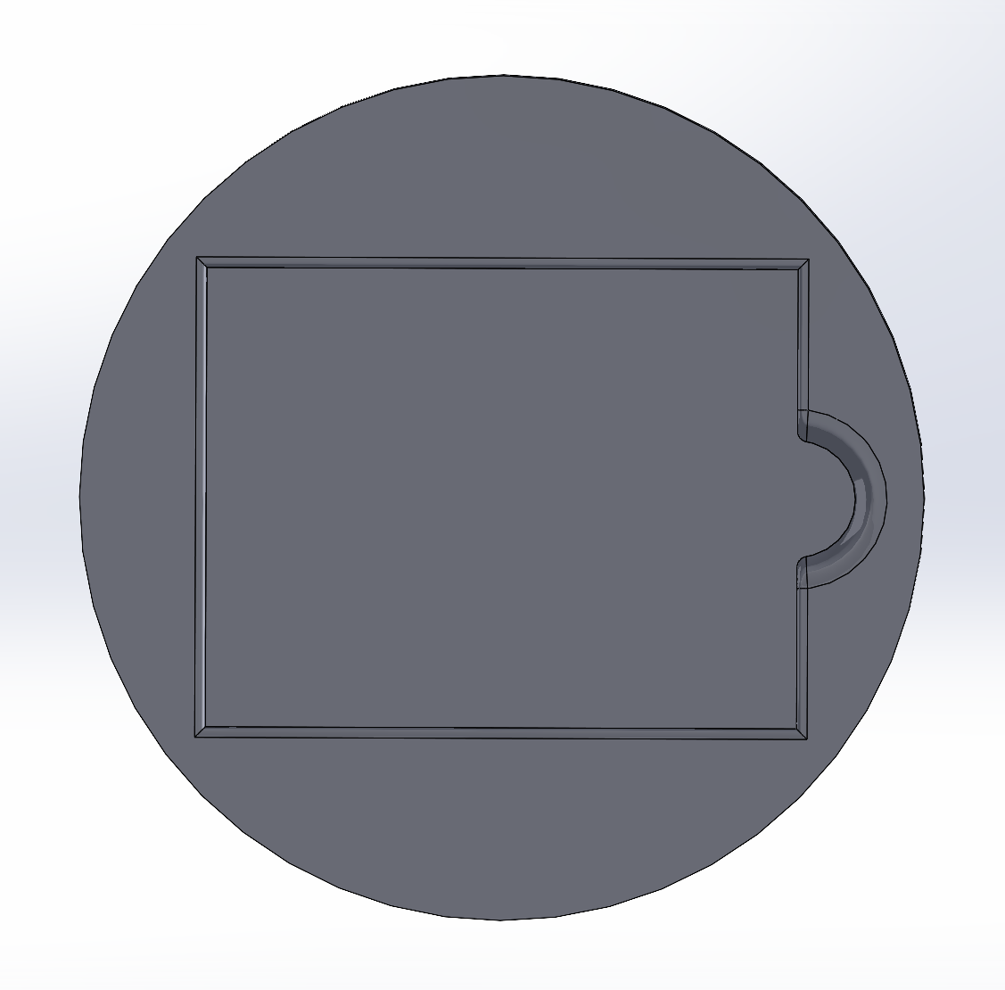
We explored Japan puzzle boxes as our main inspiration for the opening mechanism, as this add onto the mystery of the treasure inside the box, being the B6 watch for the owner to open. From our interviews with the Schofield Designer, we had to create a design that didn’t cause the owner of the box to feel like an idiot and must be user friendly, as too create a pleasing interaction with the user, while still making it unique as an opening, which was a fine line to follow.
story of watchbox
After our interview with Giles, we recognized the power of storytelling in product design—captured in his phrase, 'the best story wins.' Inspired by this, we built a narrative into our watch box to create intrigue and emotional connection.
The story: A ship carrying precious cargo—a watch—is wrecked, with only one sailor surviving. Tasked with protecting the watch, he treasures the box, believing it played a role in his miraculous survival. As his days dwindle, he carves symbols of luck and personal meaning into the box, turning it into a journal of his final moments. Years later, the box is rediscovered by the customer—still holding the watch and the tale of the sailor's resilience and devotion.
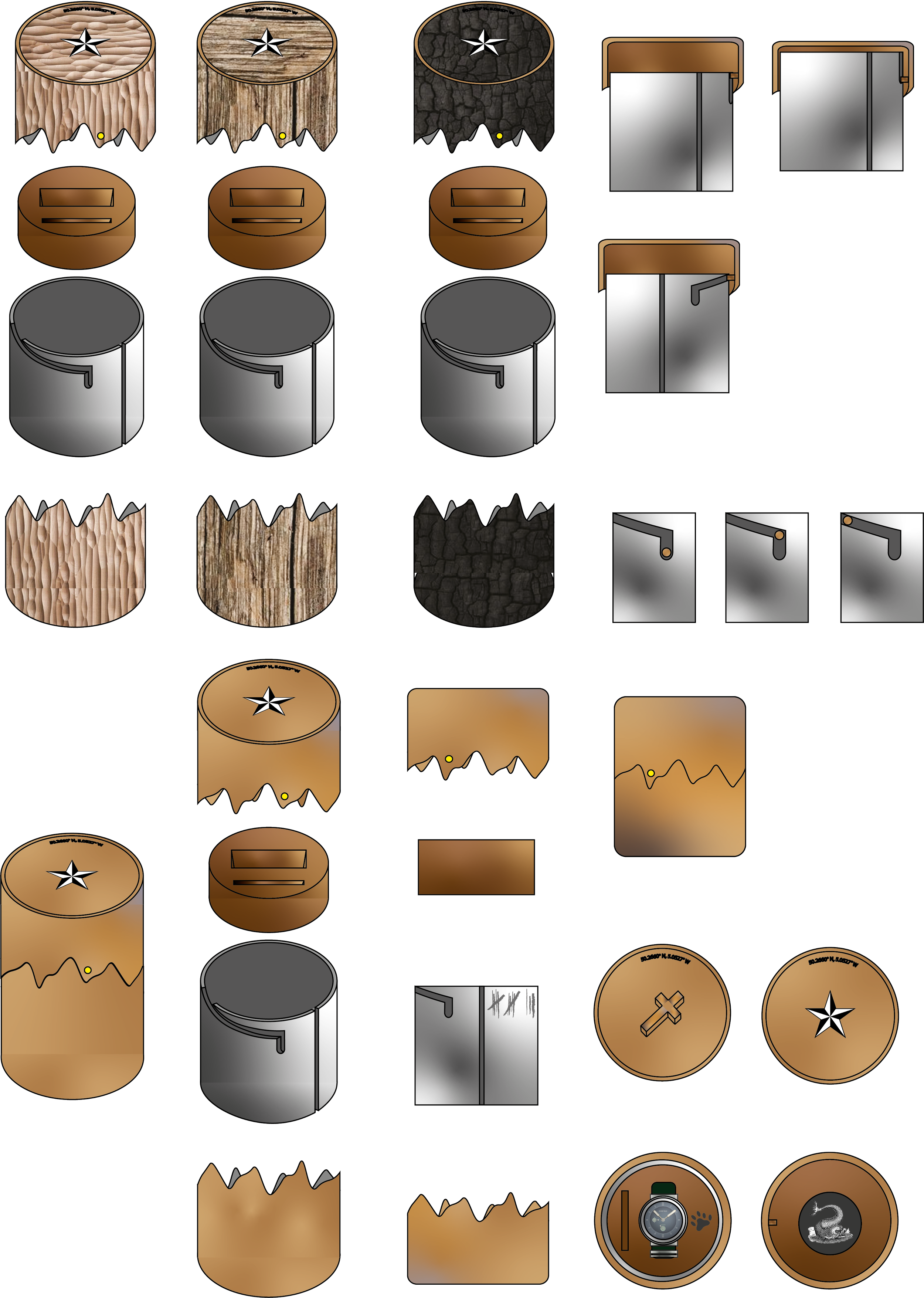
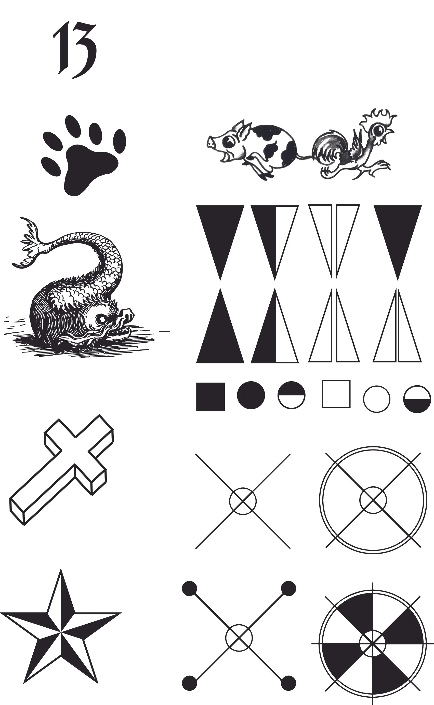
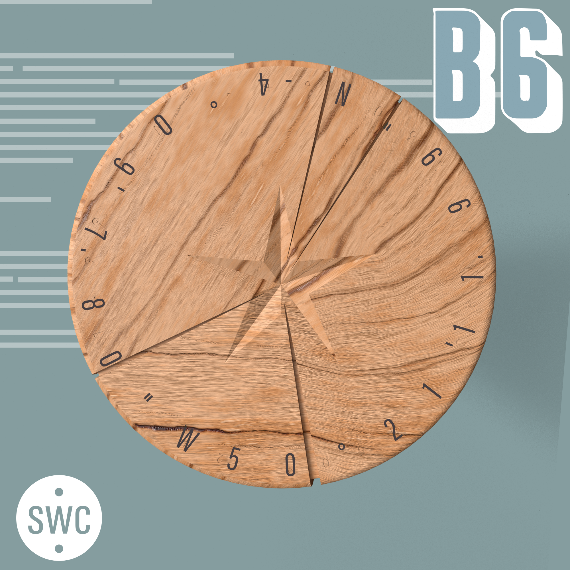
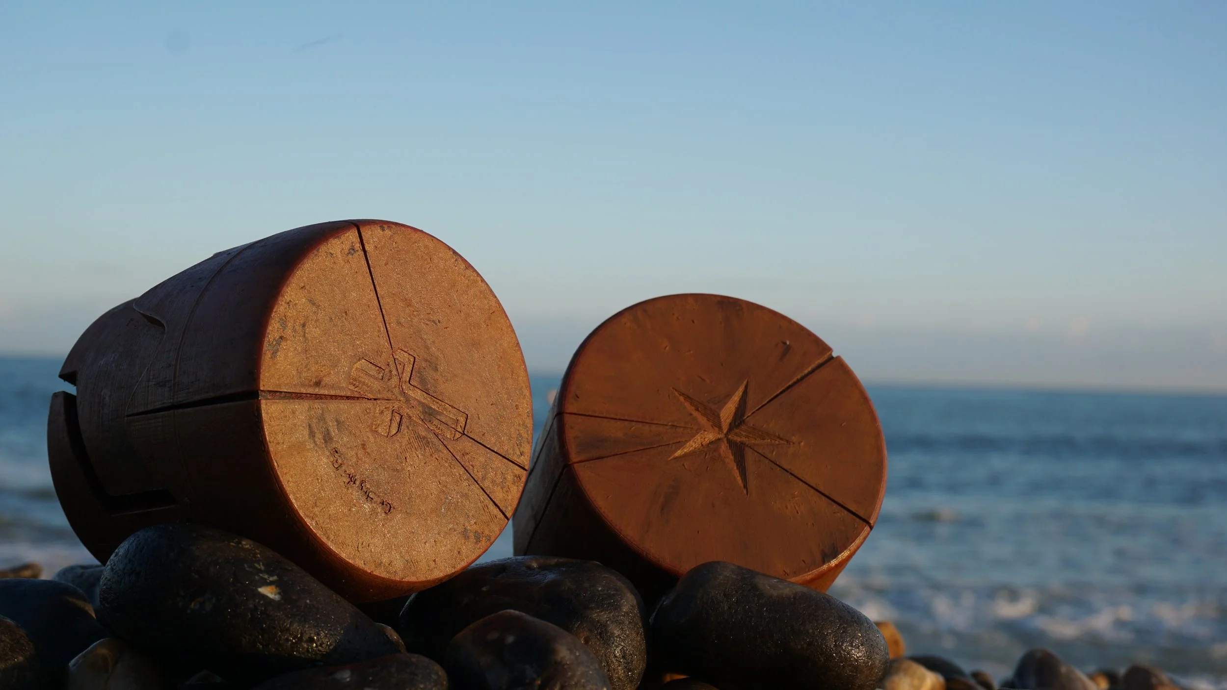
The Nautical Star
The star was used as this idea of the sailor being lost at sea and carving a star to take him home, added character to the box. This added a good link to the story while also for its aesthetic appearance. This ties in with the “tough bloke in bad weather” concept.
6 Toed Cat
We chose this as this added a wacky and interesting detail only sailors would understand, added an inside meaning to certain onlookers.
Lucky Number 13
We felt there were different implications for the number as we could create a tally within the box while also implying how long this sailor has been stranded out.
Cross
Tattooed on the bottom of sailors feet, to ward off sharks which we felt added to the story.
Pig and Rooster
Loved the story behind the pig and the rooster tattoos however, we felt that were very prominent and may be too ‘in your face’ so we considered putting it subtly on the paperwork.

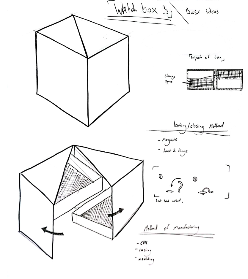
Based on client feedback, we refined the final shape of the box while shifting focus to design for manufacturing. My role involved reaching out to wood manufacturers, primarily based in China. In line with the client’s request, we prioritised partners capable of using 5-axis CNC machining—essential for producing the box as a single, seamless piece. This method was also recommended by design-for-manufacturing experts at the university to meet both technical and client-specific requirements.
final prototype
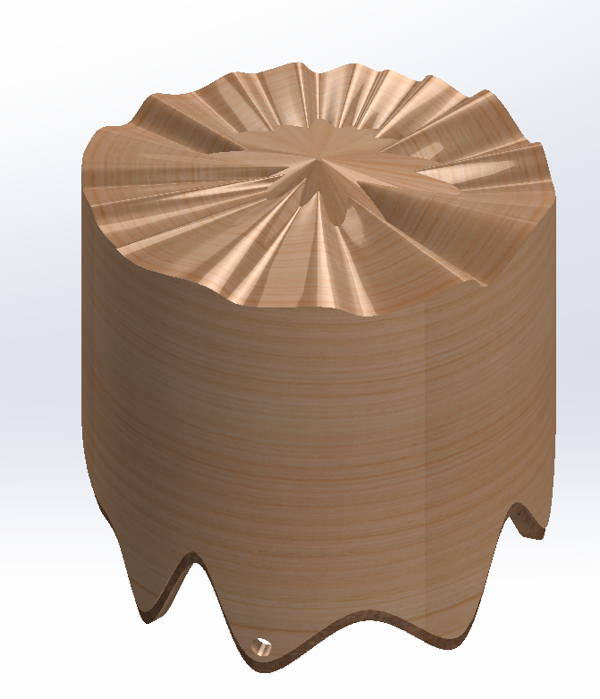
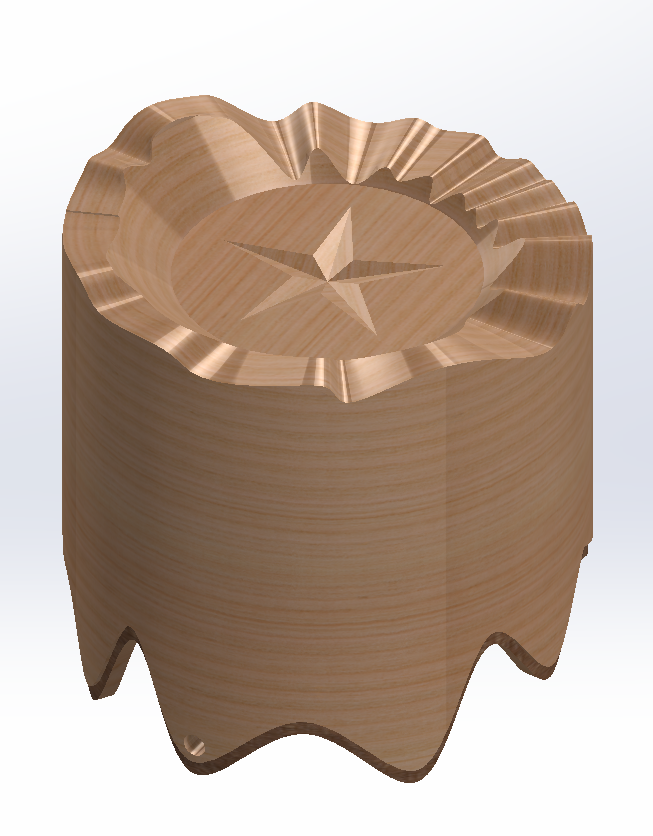
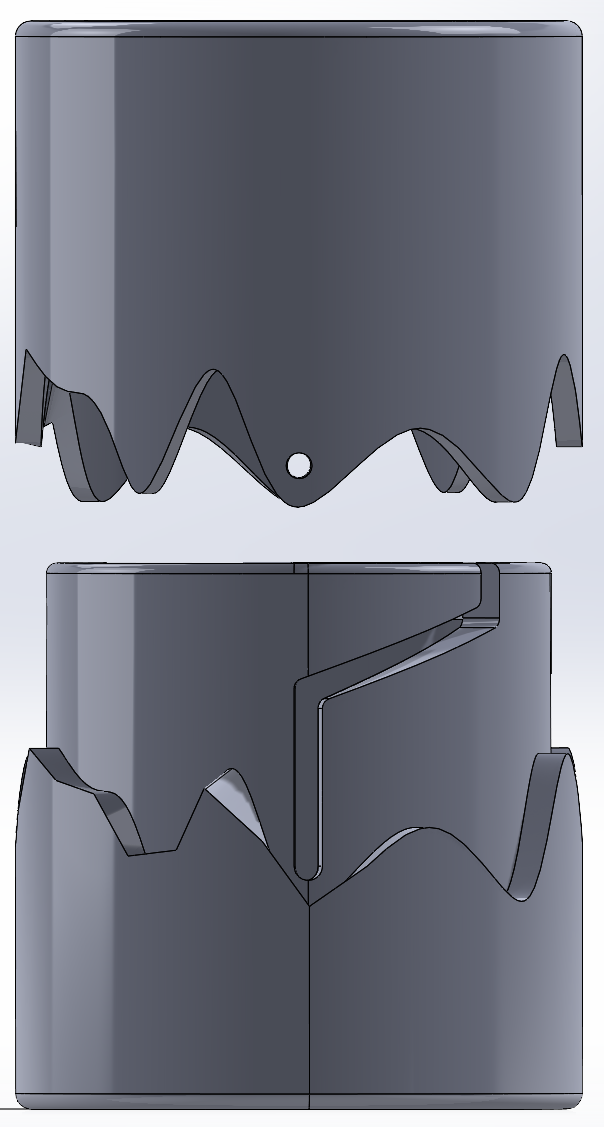
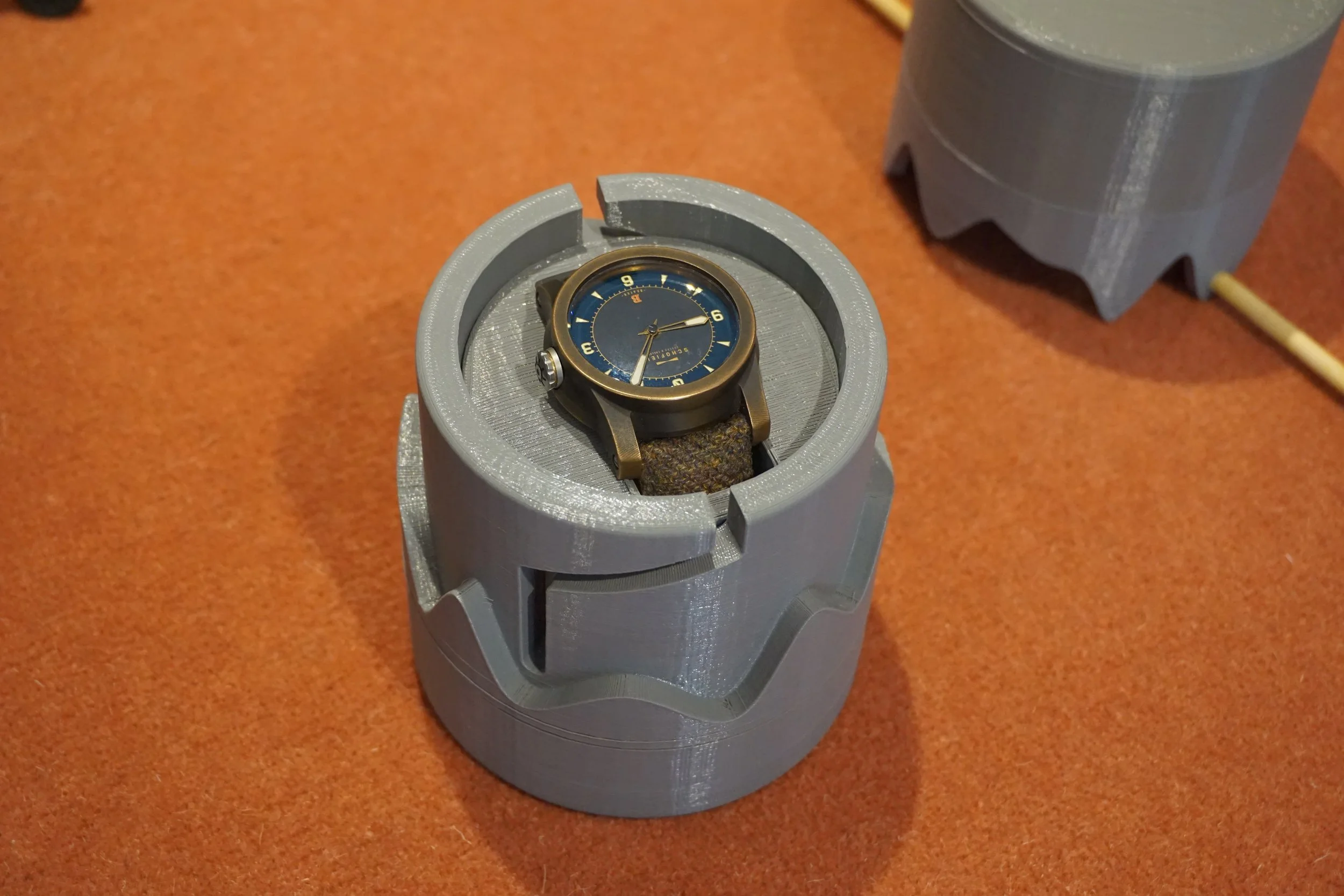
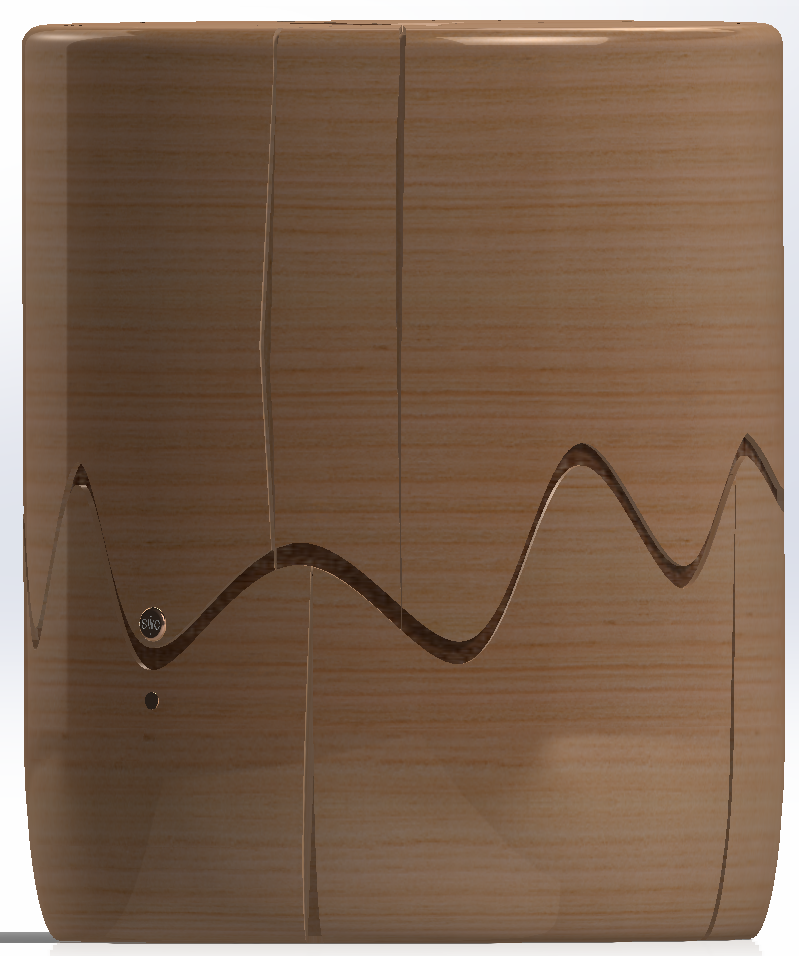
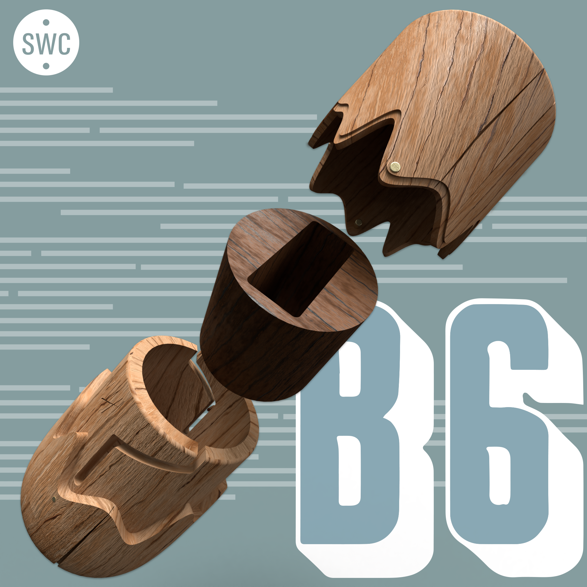
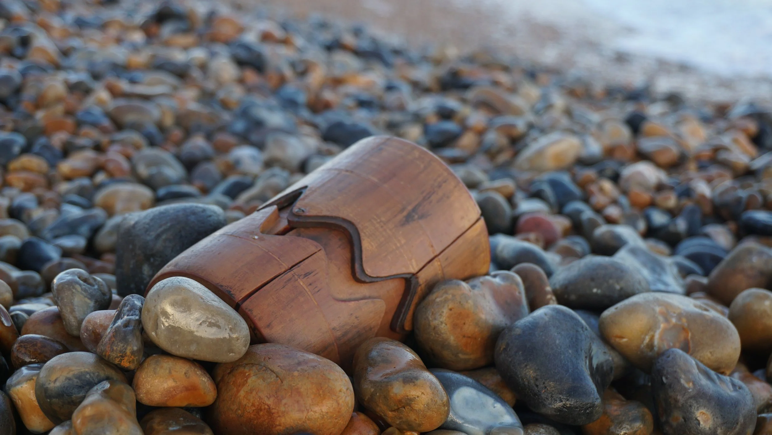
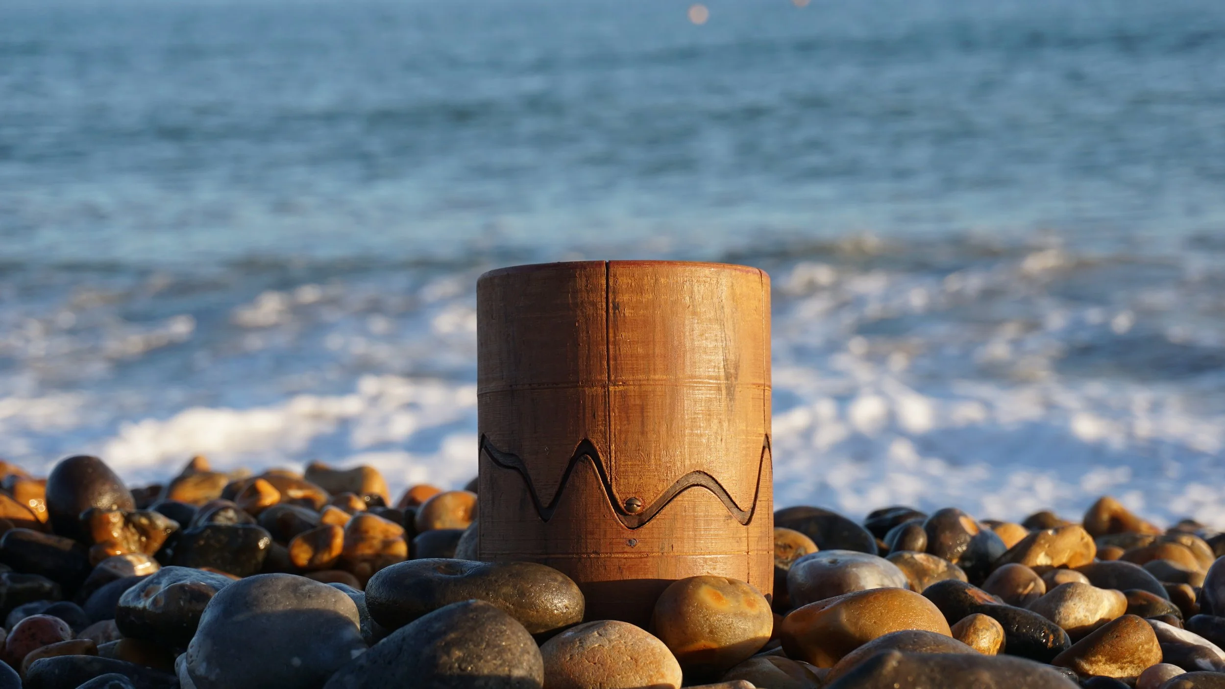
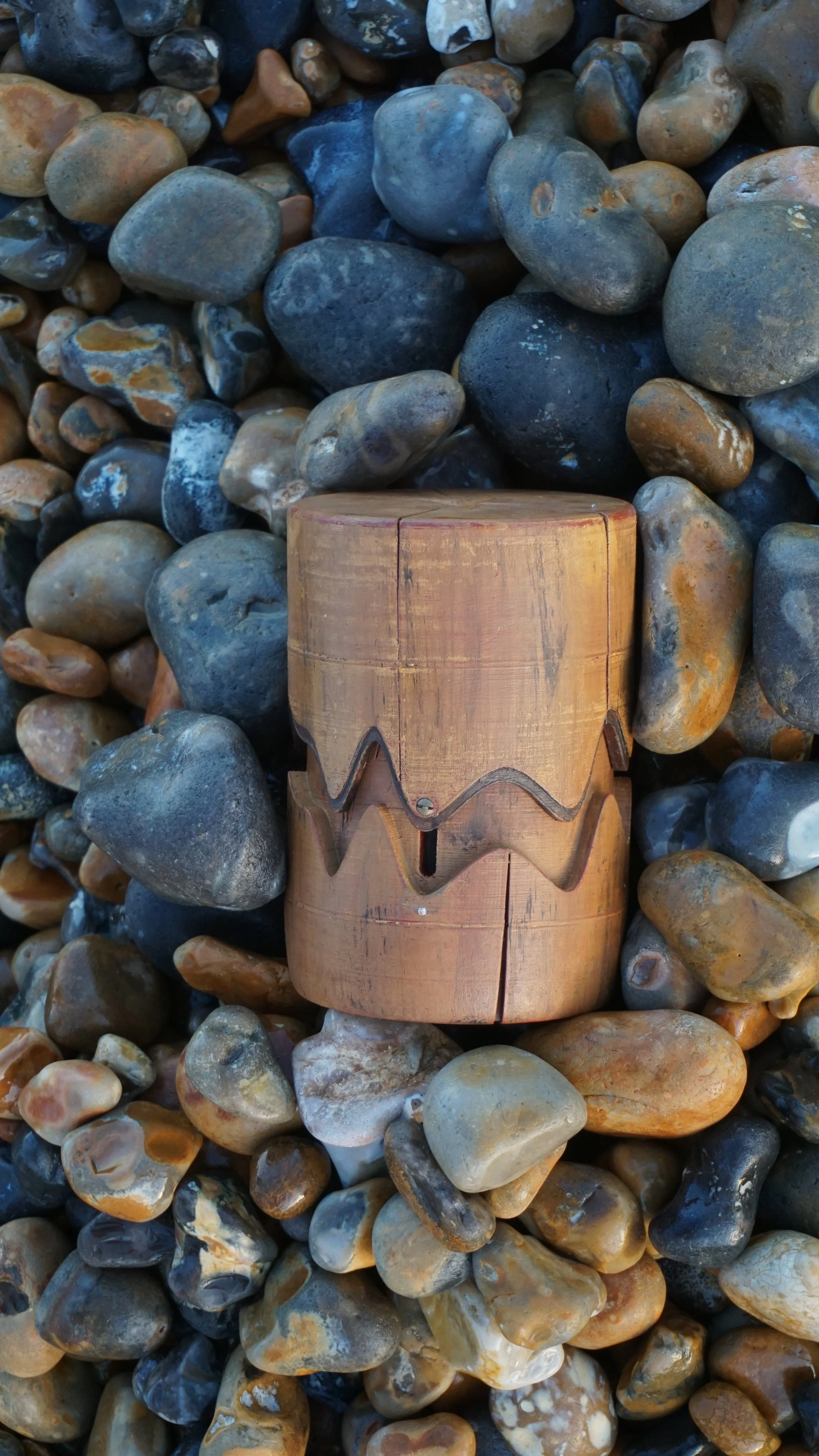
Following manufacturer recommendations, the top half of the box was redesigned with flat exterior surfaces to reduce production costs and accommodate CNC machining. The final design—our third variation—balanced manufacturability with storytelling by incorporating drafted edges and flat planes. Aesthetic cracks were also added to the sides; while they didn’t affect production cost, they significantly enhanced the box’s character and visual connection to the narrative.
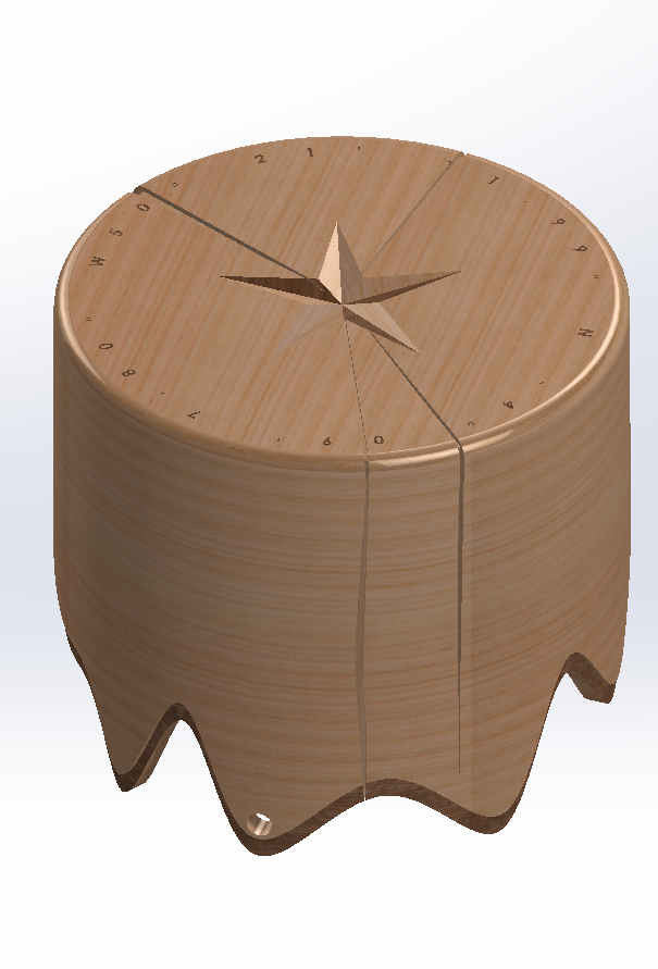
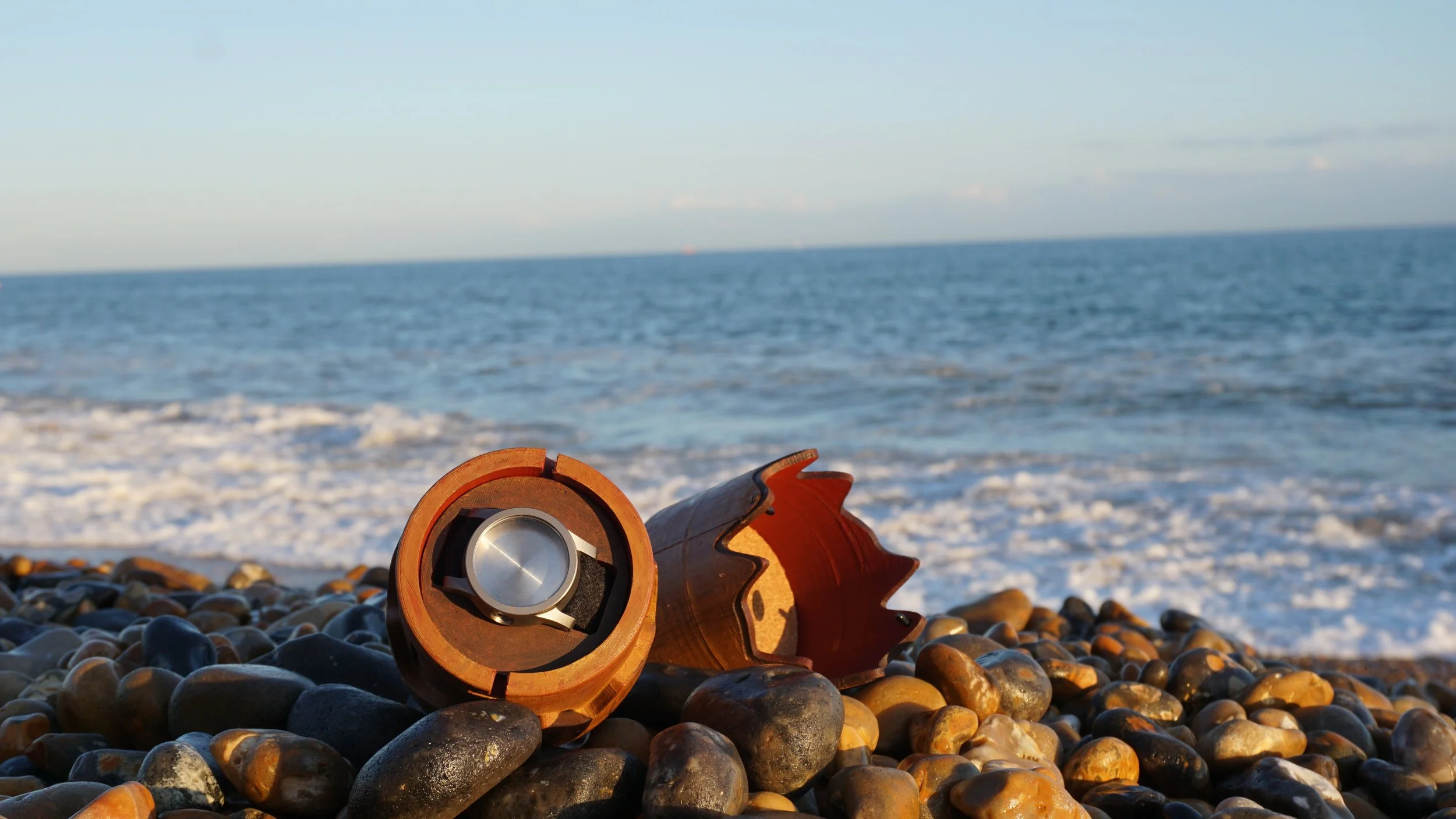
A similar approach was taken with the bottom half of the box, incorporating drafted edges and added detailing to further enhance its character. When closed, the box resembles a broken mast—a deliberate design choice guided by the client’s feedback to avoid it looking 'like a cylinder when closed.' A carved central crack creates visual relief and reinforces the narrative, adding depth and uniqueness to the overall form.
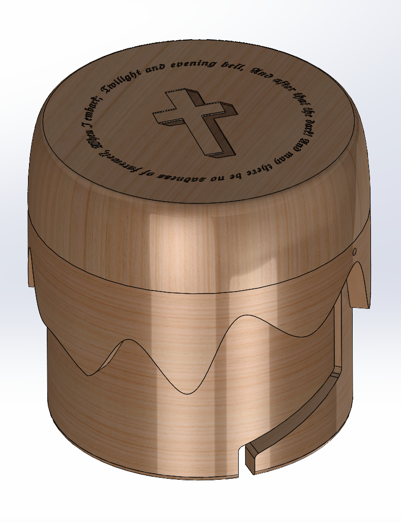
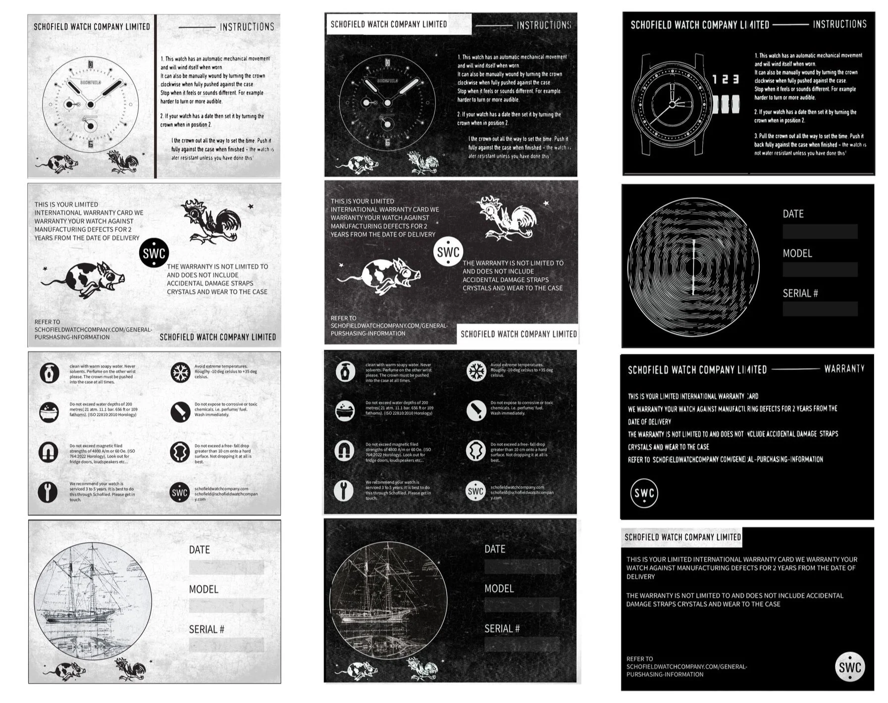
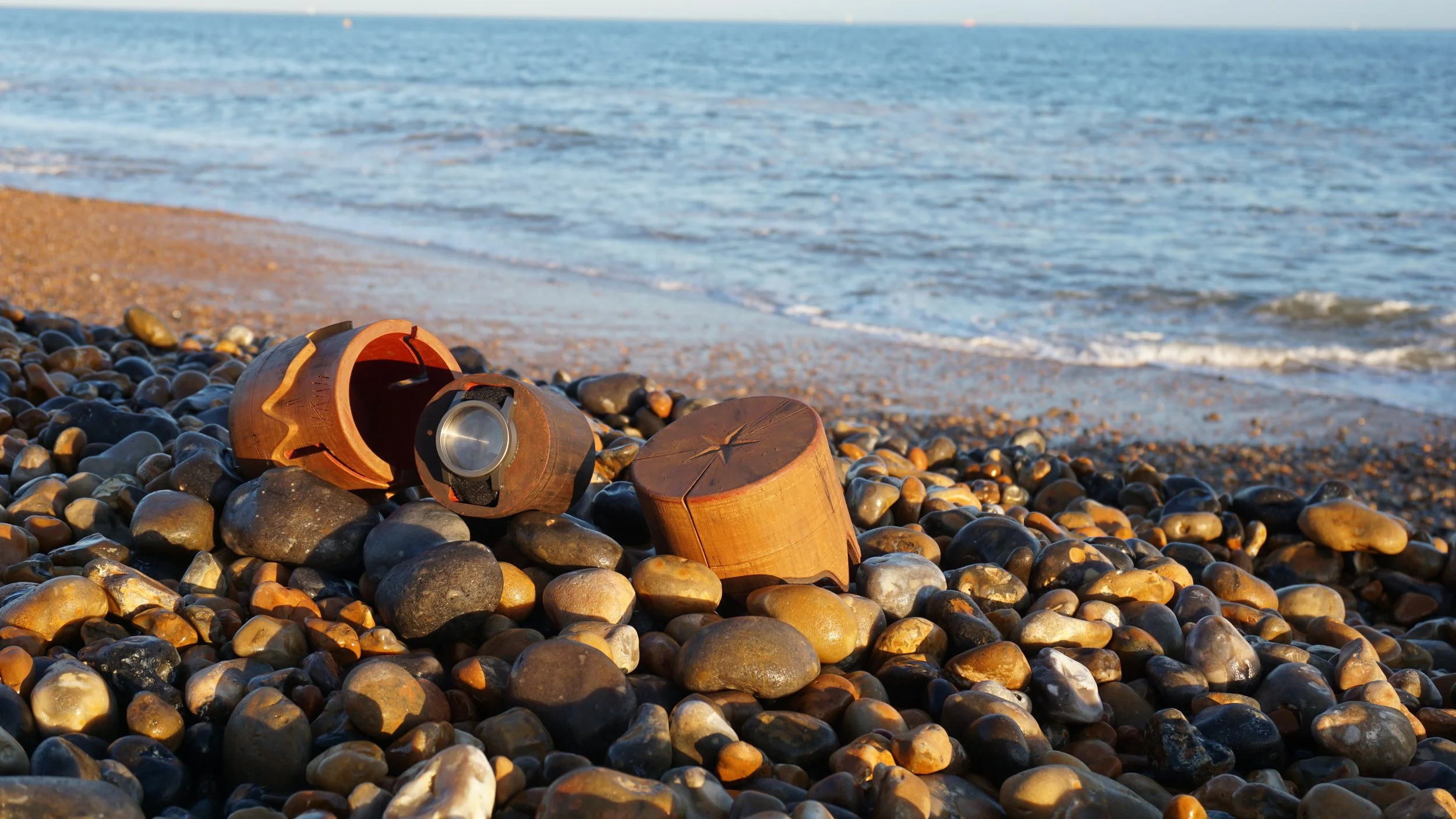
Additionally, a 'Schofield Warranty Card' will be integrated into the base of the watch insert, offering maintenance instructions and extra detailing that ties seamlessly into the overall design of the box.
packaging methods
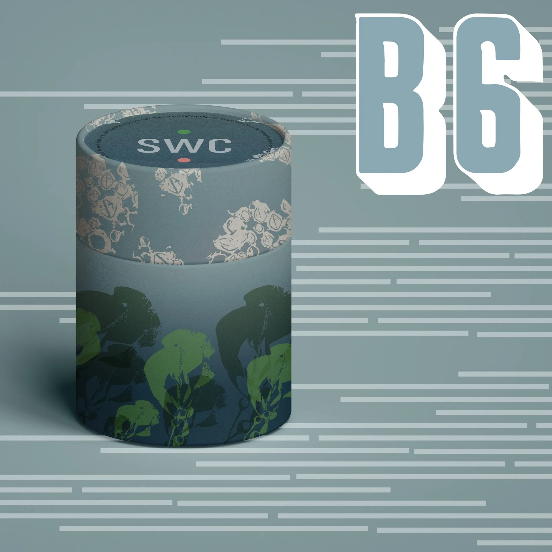
Lastly, the packaging design completes the experience with a harbour-inspired colour palette and seaweed-like detailing, evoking the feeling of an object washed ashore and covered in debris. This immersive design adds depth to the narrative and creates a memorable unboxing experience that complements the story of the watch box.
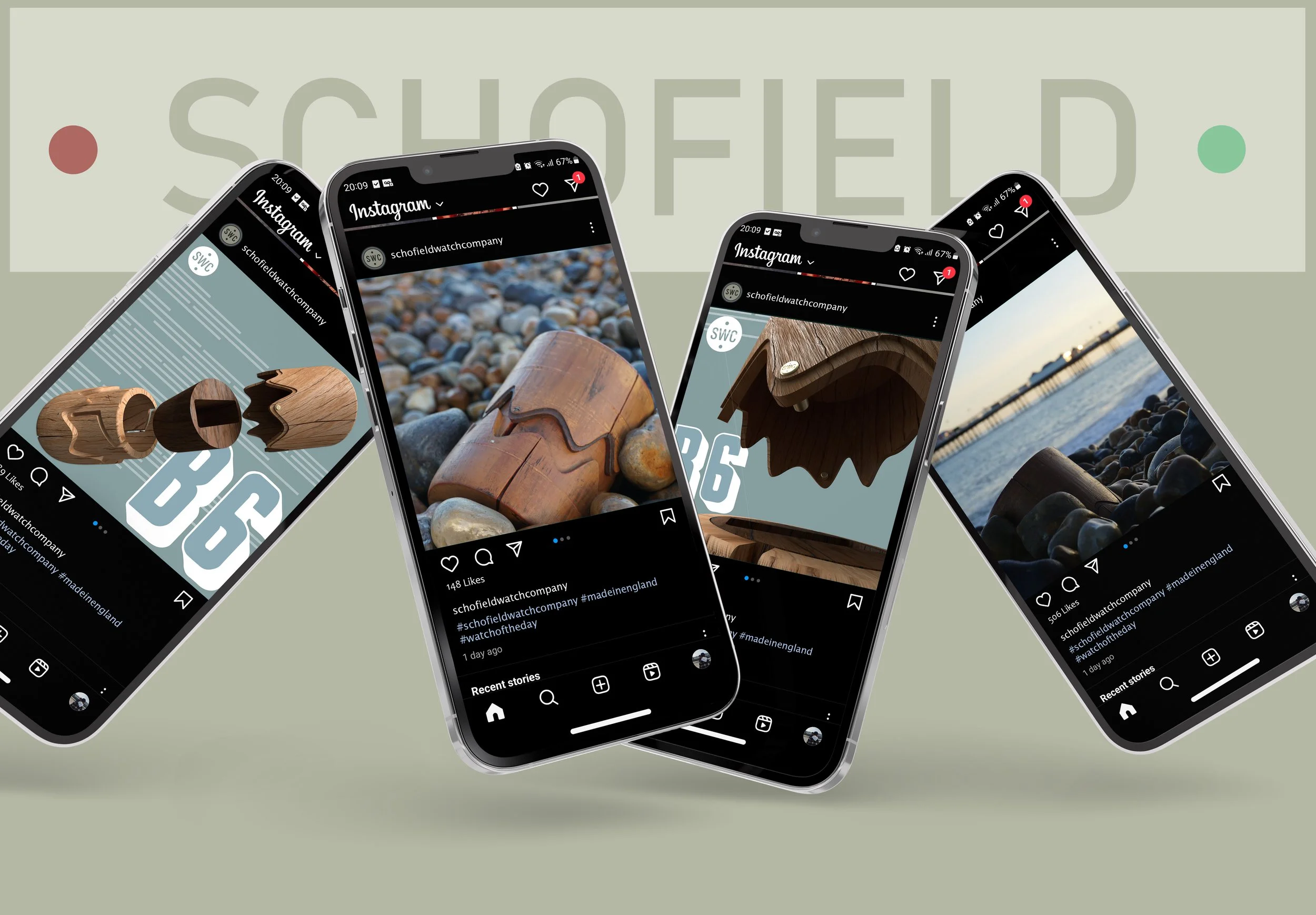
An advertisement for the B6 Watch Box was created to promote both the new watch and the rich narrative behind the box's design.
advertisement

The watch box, produced in a batch of 102 units (including 2 spares for potential transit damage), comes to a unit cost of £258. While this slightly exceeds the original budget, the client agreed that the added value of a unique and engaging opening experience justifies the additional cost.
The final design delivers a compelling unboxing journey, aligned with our original narrative intent. Its distinct detailing and form reflect both the story and the brief, resulting in a product that stands out in both concept and execution.
conclusion
Throughout this project, one of the most valuable lessons was learning how to effectively respond to client feedback. Incorporating their input often meant revisiting and redesigning elements of the concept, which challenged our flexibility and problem-solving throughout the design process.
Working within a team, we each leaned into our strengths—mine being advertisement and storytelling, while my teammates focused on physical design. This collaboration pushed us to navigate real-world manufacturing constraints, especially through conversations with manufacturers. Reaching out to suppliers was outside my comfort zone, but it taught me how to seek out critical information to bring the concept closer to a final, viable prototype.
As a product designer, I’ve sharpened my design thinking—prioritizing function to inform form—and developed the ability to turn research insights into a compelling, client-driven concept. This experience has strengthened my ability to create meaningful, well-rounded designs that balance narrative, feasibility, and user experience.